Friday, March 27, 2009

Untitled By Ms.Finder
Visual Analysis by:Ragale Russell

I attended the Arlington Museum of Art located in Arlington, TX. Most of the art pieces showcased in this museum come from local artists. These artists range in all ages from grade school up until adulthood. I was able to view a lot of interesting pieces of art but the one I chose was actually created by a local artist who was only in the fourth grade. I have chosen not to include her name because of her age but I do have a picture of her artwork. I was initially drawn to her artwork because of her choice of colors. I decided to use her image for this assignment because for her age group she showcased many talents of the artists we have studied within the last couple of chapters. There were several pieces of work from her school available for viewing but no other students used her eccentric viewpoint or abstract style.
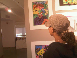
The background for this portrait consisted of a countryside. The unique part of this countryside was that it did not take a shape or form. You were able to identify the background because of the greens, yellows, and blues she used. I came to the conclusion that these colors were to mean the grass, sun, and sky. On the bottom portion of this portrait you could see a clear form of a human lying on a board. This was the only identifiable shape within the portrait. The main focal point was the outline of a human from the stomach up. The face had a sort of two faced theme to it. The face had two eyes, a nose, and a mouth but the structure of the upper portion of the face made it two-faced. On each side the artist used one of the eyes and added on what looks to be an animal’s face within the human’s outline.
The two main elements identifiable within this piece of art work are the use of lines and color. The artist used lines to define the different shapes and she used lines within her background to emphasize the balance she wanted within the painting. Her lines were curved and grooved, which in my mind represented a peaceful space. The artist used lines to define objects mainly within the outline of her human with two different animals for a face. Her dominant colors within the portrait are mainly the greens, yellows, and blues. Again these are used to represent her countryside, the sky, and the sun. She also used other colors but I was not able to determine a specific meaning for these. The artist also displayed a sort of layered attempt within the artwork that can be related to the element of space. The artist has her focal point of the human outline on top of the countryside. She also has a human shape lying on what appears to be a board as well. This human was located at the bottom of the human’s outline, rather than on the countryside which I found interesting since the main focal point was two animals within a human outline. .
The main emphasis located within this artwork would rest on the two-faced human being. The human’s eyes were included in the shape of two different animals that had their own noses. The human’s outline actually has three noses, two for the animals and one for the human. The artist used one mouth outstretched into a smile that curved into both sides of the face and even into the parts of the animals within the face. The lines that define each of these different viewpoints are what will keep your focus. The artist used bold colors rather than warm colors to maintain your attention as well.

The artwork for this analysis was a two-dimensional painting. The painting looks to have been done using water colors. The artist appears to have drawn in the background using a pencil and then it looks to have been colored in. The edges of each of her outlines do not appear to have been painted because of how controlled the strokes within this picture are. A pencil would create a very thin line that would be impossible to see once the drawing had the added colors to it. I would imagine the color was created using a fast drying paint. The edges of her outlined work do not appear to have been smudged together by running paint and her colors still appear very bold. The canvas was still very vibrant and the colors were still dark. Nothing appeared to have faded so I would also assume the painting is still in its original state.
Thursday, March 26, 2009

On the Pont de ‘Europe by Dennis Onabajo


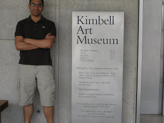
I attended the Kimball Art Museum in Fort Worth on March 21, 2009. I spent some time browsing the many paintings such as those of Monet and such. I came across a painting that for one reason or another caught my eye. It was not “flashy” by any means but I liked it just the same. The title of the piece was “On the Pont de ‘Europe” painted by Gusatave Caillebotte in 1876-1877. It is an oil on canvas piece from the impressionist era.


I believe that one of the reasons that the painting caught my eye was due to the size of the painting compared to that of those surrounding it. The painting is of three men looking over a bridge with railroad tracks in the distance. The painting itself showed many gestural lines and brush strokes as opposed to sharp contour lines. The shapes in the piece were very geometrical and had a very naturalistic color scheme. The painting was almost overcome by neutral colors with use of black, white and grey but also added a lot of blue to make the painting almost have a calm effect to it. The use of these colors used in conjunction with the men being dressed in long wool coats and hats allowed the viewer to feel the coldness in the air. You can almost feel the coldness of the steel beams from the bridge against your skin. He also displays a great understanding of atmospheric perspective as you can see the many buildings in the distance, which are of a lighter color. They are not as well defined and colorful as the huge crossbeams of the bridge and the steel posts that hold them together. There was also great attention to detail in the painting as displayed in the hair of the men. Even though you only see the back of their heads, you can see that a great amount of time was put into the definition of each strand of hair, almost as if you could feel the slight breeze and crispness in the air.


The balance of the painting was asymmetrical with the men off to the far left side and the city and railroad to the center and right. It was almost as if the painter was trying to omit them from the picture and was just trying to capture the scenery because the men were not the focus of the painting. The men in the painting seemed to be of scale and proportion. The artist used the impasto technique similar to J.M.W. Turner, as many areas had thick, rich areas of “built up” paint. They are overlooking “Gare Saint-Lazare” and the railroad tracks according to the plaque. I thought that this was a very accurate painting that demonstrated what urban life was like during this time. In studying American history during this time period, there was a huge industrial boom in where I think that the color scheme of blues, grey and black demonstrate a feeling of the time. Poor working conditions, gloomy outlooks on life and an almost dullness is displayed in this painting. In contrast, there is hope in the distance with the use of lighter colors. The men in the painting portray an almost aristocratic manner, which also reflects the coldness in the painting. This is parallel with the time of the painting where a small amount of people owned the greatest amount of wealth. It may also represent a correlation of the industrial kings with the railroad, in that they were monopolizing the use of the railroad industry as to crush competition. This is perhaps the most intriguing part of the painting that I found.


I found it interesting in reading the plaque next to the painting that the artist was a patron and collector of art as well as a talented artist. He was not made rich by his paintings, but he had a large inheritance that had given him a great wealth and a great opportunity in my opinion. In 1874, he organized the first exhibition of the impressionist paintings. The plaque also stated that he preferred artists such as Degas, Monet, Pissarro, Sisley and Renoir. I thought that it was ironic, in reading this, that his painting was situated next to Monet. It also stated that he produced over 500 works during his lifetime. One must admire a man who brought so much opportunity to the world of the impressionists. I certainly found an intriguing painting that provoked many interpretations for me.

Giovanni Bellini - Christ Blessing by Minh Nguyen

I went to Kimbell Art Museum in Fort Worth and have a look around the galleries and after the whole tour; the painting which stand out to me the most was Christ Blessing by Giovanni Bellini. The reason I picked this painting is because Giovanni Bellini put so much meaning into this art work with color, light, and emphasis. This is a portrays of Jesus Christ resurrection from death. This when Jesus is fully human and fully divine, was sent to earth to redeem humankind.

I was very impressed with the color and light Bellini used in this painting to portray Jesus. The color of Jesus body is brighten up in the painting, which have many meanings. The first meaning is that Jesus is fully alive after he was crucified to death on the cross. This has a very significant meaning in the Christian faith, because this represents the light of the faith, Jesus has gained victory over death. The light comes from his body very unique, it looks very bright, but is does not make the skin looks pale. It is hard enough to just paint the skin color just to look right, but in this case Bellini added the light to the skin which makes it stand out tremendously. His body would be first thing the audience would focus on when looking at the painting. The color he used just makes sense in every way. Moreover, the red cross Jesus is holding is very bright, which denotes his triumph over death. You will also notice that there’s a white rabbit in painting, the used of white is because this signify regeneration. In the back ground you can see dark cloud, which represent the world is a dark place, but there is a bright light coming from above. The use of color and light in this art work is just brilliant.

Bellini emphasis in the painting was also brilliant. The focus point of this art work is Jesus body. As described above, this has many meaning in the Christian faith, which Bellini painted perfectly. He used light and color to perfection. As the audiences first look at the painting they will mainly focus on Jesus body. This is the begin point of the painting, and also the final point of the painting. As looking at the painting we can see many small details which represent significant meaning. For example, the lightly visible marks on Jesus hand and the marks on Jesus body. It is very light which the viewer have to look closely to see, Bellini wanted to say Jesus is human when he sacrificed for humankind. There is a withered tree behind the picture with a bird on it. This represents the Old Covenant which also where the New Covenant will grow.

Bellini painted the art work so simple but it has so many meaning to it. There are so many small pieces which put together a complete art work. The painting starts with Jesus body and end with it, but in between there are so many stories and meaning which accommodated by colors and lights.